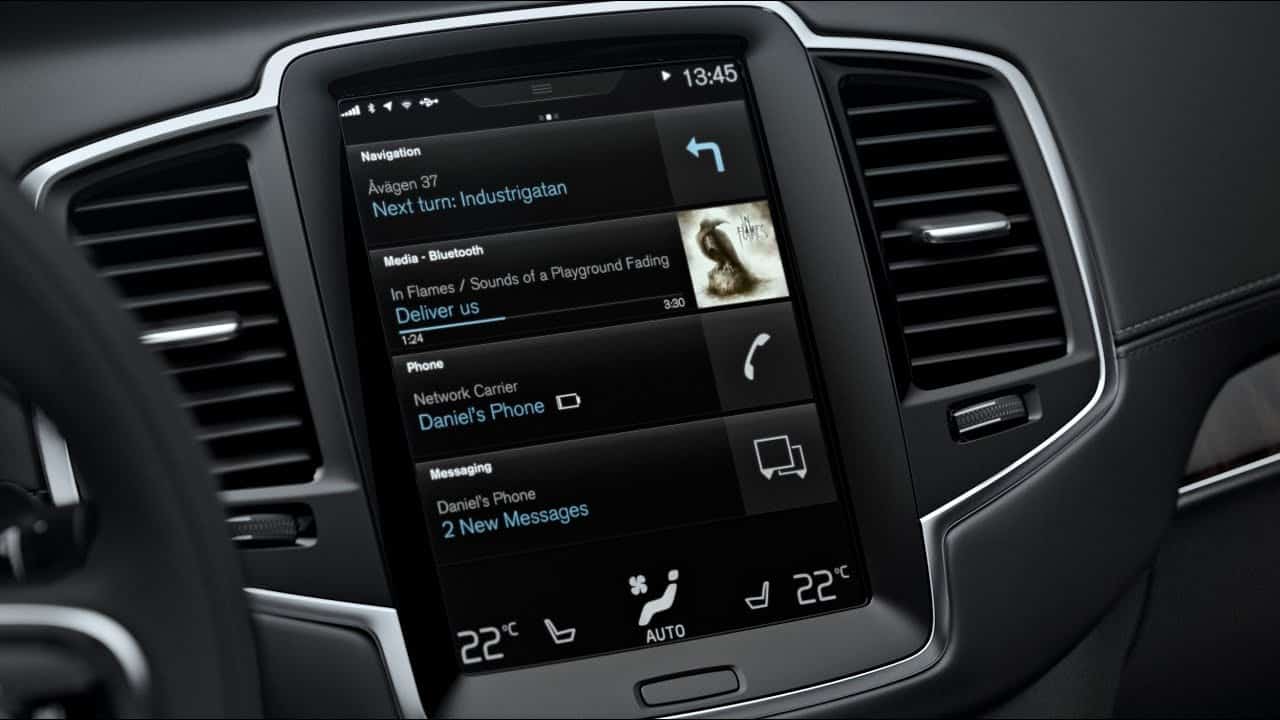

Check out the in-depth review on the new tablet-like infotainment system in the XC90!
Volvo placed a 9.3-inch touchscreen in the middle of the dash which acts more like a tablet computer than a traditional infotainment system. The display actually works a little more smoothly than Tesla’s ginormous 17-inch model although it’s much less snazzy. The overall concept allows four different data “zones” to coexist on-screen at the same time. You can choose what each of those zones will be, and to interact with them you touch the option and it expands while shrinking the others. This allows you to see the nav system’s map and your next turn directions while also seeing your media information, fuel economy, vehicle status, etc. Touch responses were lightning fast, just like the latest tablet computers and the system offers iDrive-like levels of adjustment and vehicle customization.


